
Imagine a world where “red” means something different to every printer on Earth. In the 1950s, this was a reality that cost companies like Kodak and cereal manufacturers millions in wasted product and inconsistent branding.
Enter Larry Herbert, who in 1963 revolutionized the industry with the Pantone Matching System (PMS). Today, Pantone doesn’t sell ink; it sells the formula for consistency. But with color guide sets costing upwards of $9,000, designers are asking: Why is color so expensive?
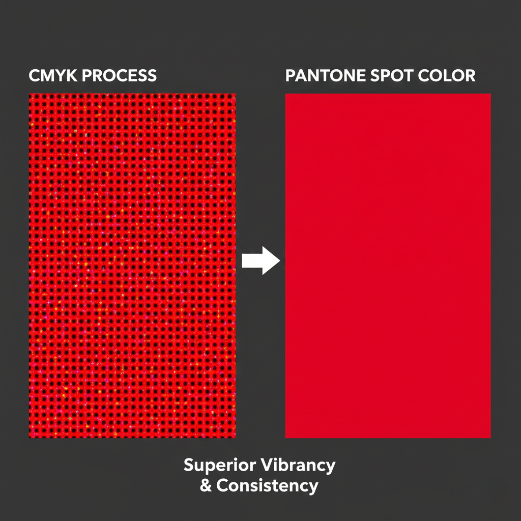
1. The Science of Consistency: Beyond CMYK
Most printing uses CMYK (Cyan, Magenta, Yellow, Black), which creates color using tiny overlapping dots. This process is limited and can often look “dingy” or “dirty”.
- Solid Color: Pantone uses 11 base inks to pre-mix specific “spot colors.” This results in a much brighter, cleaner, and more consistent look than CMYK could ever achieve.
- Repeatability: A brand like Target or Tiffany & Co. can print their signature color in New York and Tokyo, and because they use the same Pantone numerical code (e.g., Pantone 300), the results will be identical.
2. The High Cost of the “Color Bible”
The primary way Pantone makes money is through its physical guidebooks.
- The Price Tag: A single guide can cost $1,000, while a complete professional set can exceed $9,000.
- The 18-Month Expiration: Pantone recommends replacing these guides every 12 to 18 months. This isn’t just a marketing ploy; paper yellows over time, and ink fades, meaning an old guide is no longer an accurate reference.
- The Proprietary Code: You don’t pay for the color itself—Pantone doesn’t own the color. You pay for the language (the code) used to describe it.
3. The Subscription Controversy: Pantone vs. Adobe
In October 2022, the design world was rocked when Pantone colors were removed from Adobe Creative Cloud. Designers who previously had free access to these palettes suddenly found their work replaced by black squares unless they paid an additional $15/month subscription fee.
This move has led to a one-star rating for the Pantone Connect plugin and sparked a debate over whether a universal language should be open-source or proprietary.

4. Is There a Better Way?
Despite the high costs and frustrations, most professionals admit that Pantone is essential for global business.
- The “Necessary Evil”: For high-end clients, using anything else is a “competitive disadvantage” .
- The Open Source Dream: Some designers dream of an open-source color standard that could “eclipse Pantone overnight,” but the industry’s deep reliance on the Pantone language makes a sudden shift unlikely.
Conclusion: Pride in the Tangible
For designers, the high cost of Pantone is often seen as an investment in quality control. Seeing a design come to life exactly as intended—whether on a cereal box or a luxury flag—provides a sense of pride that only a universal standard can guarantee.
Watch the full investigation into the business of color here: Why Pantone Colors Are So Expensive | Business Insider


Leave a comment